This image features a single dice with all its numbers from 1 to 6 clearly visible, making it ideal for practicing consistent coloring techniques. Choose a bold color for the dice, such as royal blue, forest green, or bright yellow, to serve as the base. Each number's dots can be shaded in contrasting colors like white, silver, or even metallic gold for a striking effect. To give the dice a realistic appearance, add light and shadow effects to its edges and faces. The background can feature a soft gradient or playful pattern, like small stars or swirls, to keep the focus on the dice while adding visual interest. Don’t forget to add subtle highlights to make the numbers appear polished and detailed.
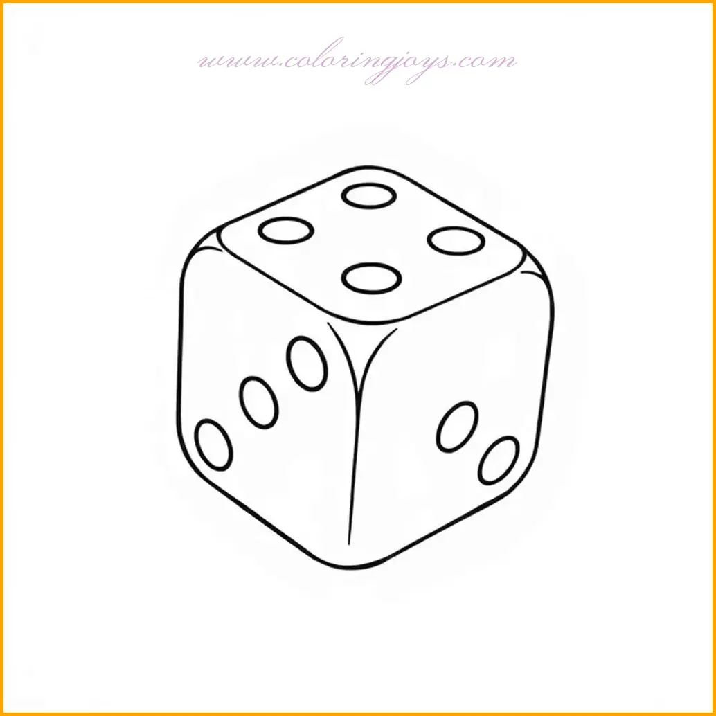
This close-up image of a dice showcases the number 5 with its neatly aligned dots forming a perfect square. The simplicity of the dice design makes it an excellent subject for creative coloring. Start by coloring the dice body with bold colors like red, green, or blue to create a strong base. The dots representing the number 5 can be highlighted using contrasting colors such as white, yellow, or black to make them stand out. Adding subtle shading around the edges of the dice will create a three-dimensional effect, making it appear more realistic. To elevate your artwork, consider coloring the background with a gradient of soft colors, like light blue blending into white, to make the dice the center of attention.The dice in this image emphasizes the number 3 with three prominent dots placed in a triangular arrangement. This design is perfect for practicing symmetry and precision in coloring. Begin by using a base color for the dice, such as orange, yellow, or even a pastel shade for a unique touch. The dots can be filled in with a darker or metallic color, like black or gold, to give a sharp contrast against the lighter body. To create a sense of depth, use shading techniques around the dice edges and between the dots. For the background, a pattern of smaller dice or a table surface texture can add context and enhance the overall artwork. Make sure to experiment with complementary color palettes for a striking visual effect.This dice features a clean and minimalist design with the number 4 displayed through four evenly spaced dots. Its simplicity allows for a wide range of creative coloring possibilities. Use a bright, solid color like sky blue, lime green, or bright pink for the dice’s body to make it cheerful and inviting. The four dots can be colored in a contrasting shade, such as dark purple or jet black, to ensure they are clearly visible. To give the dice a realistic appearance, add soft shadows on the dice’s sides and beneath the dots. A plain or textured background, such as wood grain or a gradient, can complement the dice without overpowering its simplicity. For extra creativity, add decorative patterns or symbols on the empty spaces around the dice.This dice focuses on the arrangement of four small dots forming a perfect square, highlighting the number 4 in a classic dice design. Begin by choosing a vibrant color for the dice body—perhaps a rich red, deep green, or royal blue. The dots can be filled with a neutral shade, such as white or black, to stand out prominently against the dice’s bold color. Enhance the dice’s three-dimensional appearance by adding soft gradients on its edges and lighter tones in the center to mimic lighting effects. The background can be enriched with subtle textures or patterns like checkerboards or polka dots to match the playful theme of dice. You can also experiment with incorporating shadow effects beneath the dice to give it a realistic placement on a flat surface.This image features a dice with the number 4 displayed prominently, resting on a flat surface. Start by coloring the dice body with a bold, eye-catching color like crimson, emerald, or sapphire to give it a polished look. The dots forming the number 4 can be shaded in metallic colors, such as silver or gold, for a luxurious touch. To add depth, carefully apply darker tones along the edges of the dice and lighter tones toward the center, mimicking the effect of light reflecting off its surface. For the flat surface beneath the dice, choose a complementary color or texture, such as a wooden or marble pattern, to create a realistic scene. This approach not only highlights the dice but also adds an artistic dimension to your coloring.The simplicity of this dice is highlighted by the single dot representing the number 1, neatly positioned in the center. This minimalistic design opens up a variety of creative options for coloring. Consider using a bold, monochrome color for the dice body, such as deep black, vibrant orange, or pastel blue. The single dot can be shaded with a striking color like gold, red, or white to make it the focal point of the image. Add soft highlights and shadows along the dice edges to enhance its volume and give it a realistic touch. For the background, experiment with abstract patterns or gradients, such as a soft fade from white to light gray, to keep the focus on the dice. You can also add small decorative elements, like sparkles or stars, to create a whimsical effect.This large dice prominently displays the number 5 with simple, bold dot markings. Begin by choosing a striking color for the dice body, such as deep blue, fiery red, or glossy black, to create a bold impression. The five dots can be filled in with contrasting colors, like pure white or golden yellow, to ensure they stand out vividly. Enhance the three-dimensional look of the dice by shading its edges with darker tones and adding subtle highlights to the top and sides. To complete the scene, color the background with a complementary shade or a gradient, such as a soft blue-to-white blend, to draw attention to the dice. Adding a faint shadow beneath the dice can give it a realistic touch, making it appear as if it’s resting on a surface.This image depicts a pair of dice in motion, revealing the numbers 3 and 4 on their surfaces. For the dice bodies, consider using contrasting colors like emerald green and vibrant red to create a dynamic look. The dots forming the numbers can be filled with neutral tones such as black or white to emphasize their visibility. To capture the motion, use subtle gradients and directional shading to create a sense of depth and movement. The background can feature a textured surface, like a gaming table or a patterned rug, to enhance the context. Adding a few sparkles or motion lines around the dice will further emphasize their lively roll.This image showcases five dice scattered randomly, offering a variety of numbers and angles for creative coloring. Start by selecting a diverse palette of colors for the dice bodies—think shades of orange, teal, yellow, purple, and red—to make each dice unique. The dots on the dice can be filled with darker tones like black or navy blue for contrast. Use shading to give each dice a distinct three-dimensional look, paying attention to their edges and the angles of light. The surface beneath the dice can be colored with a neutral or textured pattern, like wood grain or stone, to set a natural scene. To add a whimsical touch, include subtle shadows for each dice to create depth and realism.This pair of dice is placed side by side, showcasing the numbers 1 and 5 with clean, precise dots. For the dice bodies, consider choosing harmonious colors like pastel pink and sky blue to create a soft, cohesive look. The dots can be shaded in a darker hue, such as black or deep gray, to contrast against the lighter dice colors. Use shading to highlight the dice’s edges and corners, giving them a realistic and polished appearance. The background can be colored in a neutral shade or subtle texture, such as a soft beige or light gray, to maintain focus on the dice. Adding a shadow below the dice will further enhance their depth and make the artwork stand out.This image depicts two dice stacked on top of each other, each showing different numbers, creating an engaging composition. For the bottom dice, use a darker color like midnight blue or crimson red, and for the top dice, a lighter shade like sunny yellow or pale green for contrast. The dots on both dice can be colored in neutral tones, such as black or white, to maintain clarity. Add shadows and highlights on the dice to give them a stacked and three-dimensional look, focusing on the overlapping areas to emphasize depth. The background can feature a subtle gradient or simple pattern to keep the focus on the dice while adding an artistic touch. Including soft shadows beneath the stack will make the composition appear grounded and realistic.